

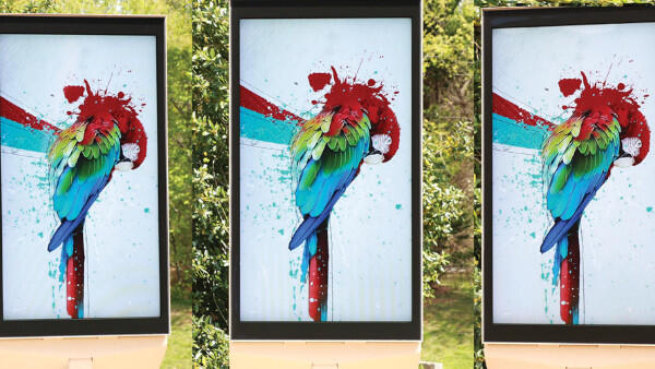
Our eyes take great delight in being easily entertained with rich colors and deep contrast. Ideally, that’s the goal when we use digital displays for business purposes. But great-looking displays don’t happen by chance. Creating a great-looking display requires an exact match between human vision and display technology. The technology must use the visual capabilities our eyes already have.
Considering Contrast
Many factors influence display quality. One key factor is how well displays reproduce dark areas in ambient light. This might seem contrary to intuition – that the brighter regions of an image should dominate image quality. If dark regions are not truly dark, image quality loses depth. This happens even when brighter regions become increasingly bright.
What Brightness Contrast Means
Brightness contrast describes the difference between the brightest and darkest parts of an image. These areas are often described as white and black. This is often expressed as a ratio: white/black. Examples of high and low brightness contrast images are shown in Figure 1 below. Certainly the high brightness contrast image on the left is more appealing than the low contrast image on the right.

Why Ambient Light Changes Contrast
Contrast ratio is traditionally measured in the display industry under the very special condition of no ambient background lighting. Displays are seldom operated in a pitch-black environment, though, and typically compete with many sources of ambient light.
Harry Presley is an optical engineer at MRI, an Atlanta-based display manufacturer. He said, “It is useful to consider the observed contrast ratio with the display environment in mind. Under these conditions, the observed contrast ratio acts like a signal-to-noise ratio. Ambient light behaves like noise, which can degrade observed contrast.”
Color Gamut and Saturation
Color gamut is another important factor when evaluating a display. It describes the total range of colors a display can produce. A large color gamut is synonymous with deeply saturated primary colors: red, green and blue. Examples of high and low color saturation images are shown in Figure 2. These two images have the same brightness contrast, but the high saturation image on the left is obviously more appealing.

Why Backlight Spectrum Matters
While having high color saturation is very important, white regions of displayed content must be purely rendered as well. Obtaining both of these attributes requires careful colorimetric engineering as well. The backlight’s optical spectrum must align with the red, green, and blue filters. These filters sit inside the liquid crystal glass. “MRI, for example, achieves this optimization using fully customized LED spectrums in all of our LCD products,” Presley said. “That results from using state-of-the art simulation and testing tools.”
The Capability of Vision
High contrast improves both brightness and color performance. It helps create images that look appealing and grab attention. Conversely, low contrast images seem dull as a result of degraded information.
How the Human Eye Perceives Brightness
The human visual system is complex. It blends perception, adaptation, sensitivity, acuity, day and night vision, aging, and other factors. One phenomenon of human vision involves relative brightness perception. People do not judge brightness on an absolute scale. Instead, they compare brightness with nearby objects in their immediate focus. For example, the middle stripe in Figure 3 appears brighter on the left side. In reality, the stripe does not change at all. Also note that there is a specific point near the middle where the center stripe virtually disappears into the background. This is where the contrast ratio exactly equals 1 and the stripe cannot be resolved. Brightness is a relative perception. Contrast also affects the ability to resolve details in an image.

Understanding Instantaneous Dynamic Range
The human eye is capable of seeing a total brightness range of 1012 or more, but not simultaneously. For typical light levels the eye has an instantaneous dynamic range (IDR) of ~104 (10,000:1). You can view IDR as a sliding window of dynamic range. The eye moves that window as it adapts to different brightness levels. The center of the IDR is set by the average brightness within our field of view at a particular time.
Why Perceived Brightness Compresses
As the actual brightness increases, though, the eye becomes less and less sensitive to changes in brightness. Said another way, it takes increasingly larger steps of actual brightness in order to realize equal steps of perceived brightness. Due to this compressive behavior the eye perceives just 360 nits as being half-way (50 percent of IDR) to the maximum of 2,000 nits.
Overcoming Ambient Light
So what gets in the way of displaying high contrast images? “The biggest enemy in outdoor or any high-ambient light applications is the reflection of ambient light from the front of a display,” Presley said. “These ambient reflections will effectively limit how black a display can go, akin to raising the noise floor of the display,” he said. “Also, reflected light will mix with the light being emitted by the display, so at the same time the color gamut will be compressed.”
Specular vs. Diffuse Reflection
Reflections are often categorized as being specular or diffuse. Specular reflection, also called glare, represents mirror-like reflection. Specular reflection can be an issue for both daytime and nighttime operation, as there can be many relatively strong sources of light at night as well. On the other hand, diffuse reflection represents scatter-like reflection, such as from a piece of rough paper. Diffuse reflection causes an incident ray of light to break into many smaller rays over a full hemisphere of reflected angles. Therefore, objects and light sources become “scattered” and unrecognizable upon reflection.
In reality, practically nothing exhibits purely specular or purely diffuse reflection. Since specular reflection is mirror-like then its effects are viewing angle dependent, whereas diffuse reflection has very low angular dependence. The low contrast image shown in Figure 1 is indicative of a display having a high diffuse reflection because the image is uniformly degraded and there are no obvious mirror-like reflections from any external objects or ambient light sources.
How Much Contrast Ratio Is Enough
How much contrast ratio is enough? Many commercial displays claim to exceed 1,000,000:1, but this is always measured in a dark room with no ambient light. In truth, relatively modest contrast ratios can be sufficient for maintaining attractive content. Figure 4 below illustrates various contrast ratios via simple grey-scale blocks. Within every block the lighter colored square is the same shade; only the outer ring of each block is being varied. The difference between contrast ratios of 20:1 and 30:1 is scarcely evident, so 20:1 would appear to be a sufficient goal.

Direct Sunlight and Display Reflectivity
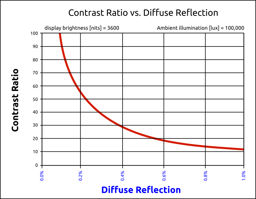
Solar illumination on the face of a display represents the most significant challenge to contrast ratios. At midday with a clear sky, the sun can produce up to 100,000 lm/m2 of illumination onto a surface directly facing the sun. If this illumination were to then reflect from a perfectly white, diffuse object similar to a sheet of white paper, the brightness of the reflection would be about 32,000 nits.
Assuming a display that can produce 3,500 nits for white content, and desiring a minimum contrast of 20:1, then the effective “brightness” for black content, including solar reflection, must be limited to 175 nits (3,500 nits ÷ 20). The maximum diffuse reflection of solar illumination by the display is therefore 175 nits. Finally, the allowed diffuse reflectivity of the display is 0.55 percent (175 nits ÷ 32,000 nits).
What to Look for in Diffuse Reflectance
“When evaluating a display, look for one where diffuse reflectance does not exceed 0.4 percent,” Presley said. “On average, MRI displays produce a diffuse reflectivity of only 0.2 percent, which equates to a minimum contrast ratio of 54:1 in direct sunlight. Even in a worst-case scenario with full solar illumination, MRI still maintains a contrast ratio of 28:1.”
Optical Filters
The use of infrared (IR) filters to reduce solar heat absorption can also degrade image quality. It is very difficult to create commercially viable IR filters that do not have undesired effects in the visible portion of the optical spectrum, especially at the red end of the visible spectrum. Similarly, the use of ultraviolet (UV) filters can degrade image quality at the blue end of the visible spectrum. The use of IR and/or UV filters is easy to spot by the unnatural tint that they impose on images and reflections, by the way that they shift the colors of a displayed image as a function of viewing angle, and they also tend to have a reflective mirror-like appearance.
Why Some Manufacturers Use Optical Filters
Why, then, would a display manufacturer use such filters? The answer is usually out of desperation! If a manufacturer is using a liquid crystal panel that is not rated for high temperature operation (e.g., a high clearing-point temperature), has a poor overall design for thermal management, and/or has not used smart ways to reduce UV damage, look for strange colored tints and poor color reproduction and luminance when viewed off-angle.
In summary, a “great looking display” is given that title by the humans that view it. The mindset behind the design of a great looking display begins with the interaction between the human eye and the display. It is further developed as we take into account where that interaction will take place. In other words, we have to consider how the environment where the display is operating will affect the way the human eye perceives the visual image, and design around that. That’s the key.
This article originally appeared on Digital Signage Today. Author credit to Richard Slawsky.